MESSAGE MAIL CASE STUDY
ROLE
Lead researcher and designer
PROBLEM STATEMENT
Due to the increasing number of social media, It’s getting harder than ever to reply to important emails and messages. That’s when Message Mail comes into play. Message Mail allows the user to connect all their social media together in one location, making replying much easier and faster. I have designed a beautiful interface, with compelling typography and stunning colors to make MessageMail known worldwide.
APPROACH
My goal was to create a landing page for an app/site that connects all social media, so the user can reply to emails from one location. For this to become a reality, I started intense and deep research, from studying how to design a beautiful and easy-to-use interface for a younger audience to making MessageMail a worldwide-known application and website.
PROCESS
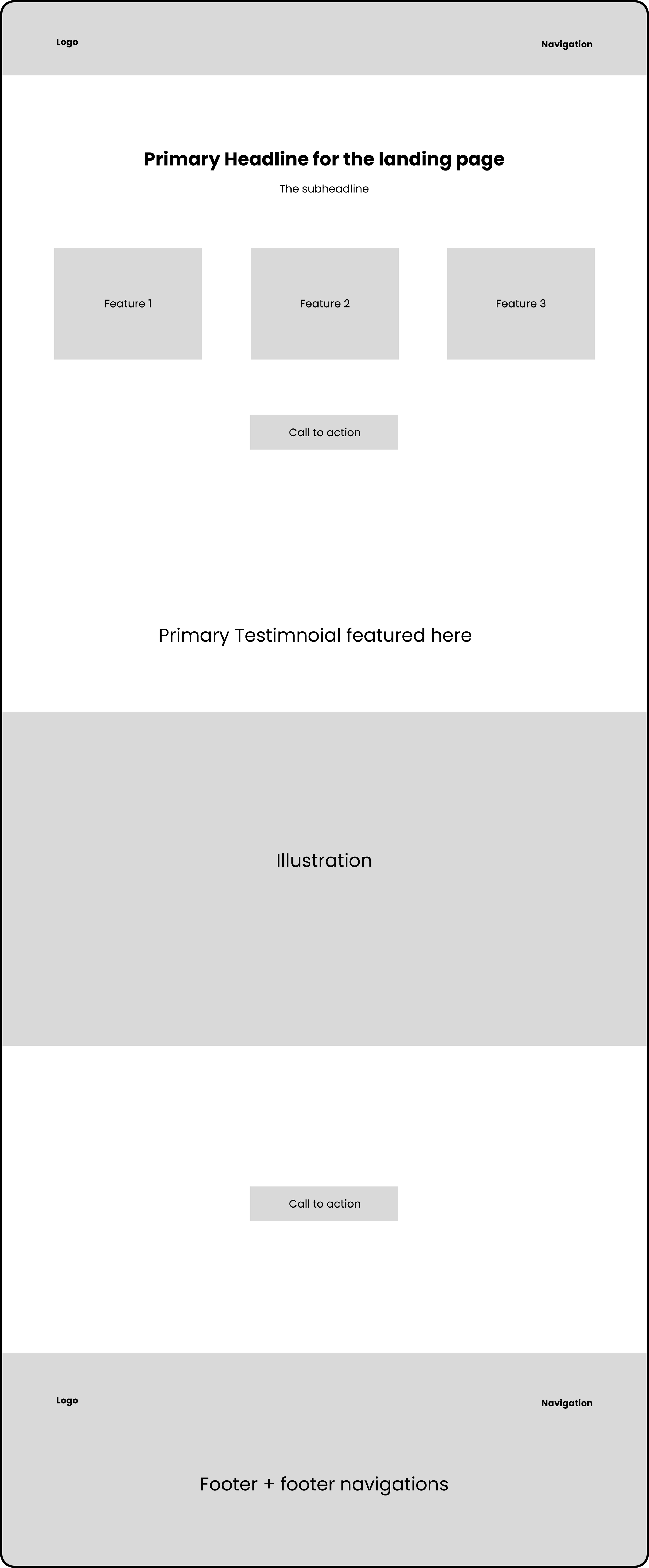
After the research, came the creating of mockups. I started the project by creating low-fidelity mockups for both a desktop version and a mobile application.
MOBILE LOW-FI MOCKUPS
DESKTOP LOW-FI MOCKUP
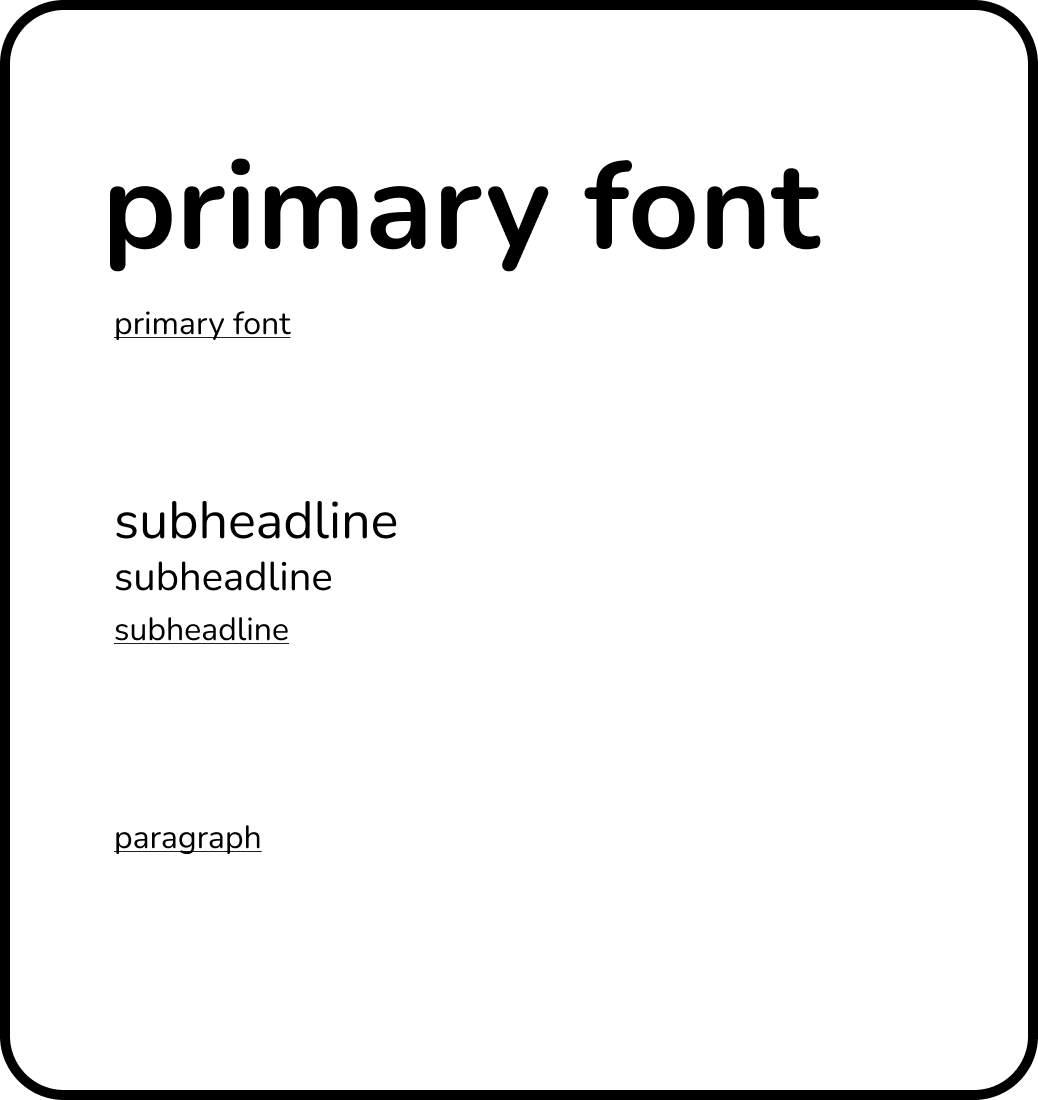
The next process was choosing the colors and fonts. Selecting colours that were complementary and fonts that suited the specific users.
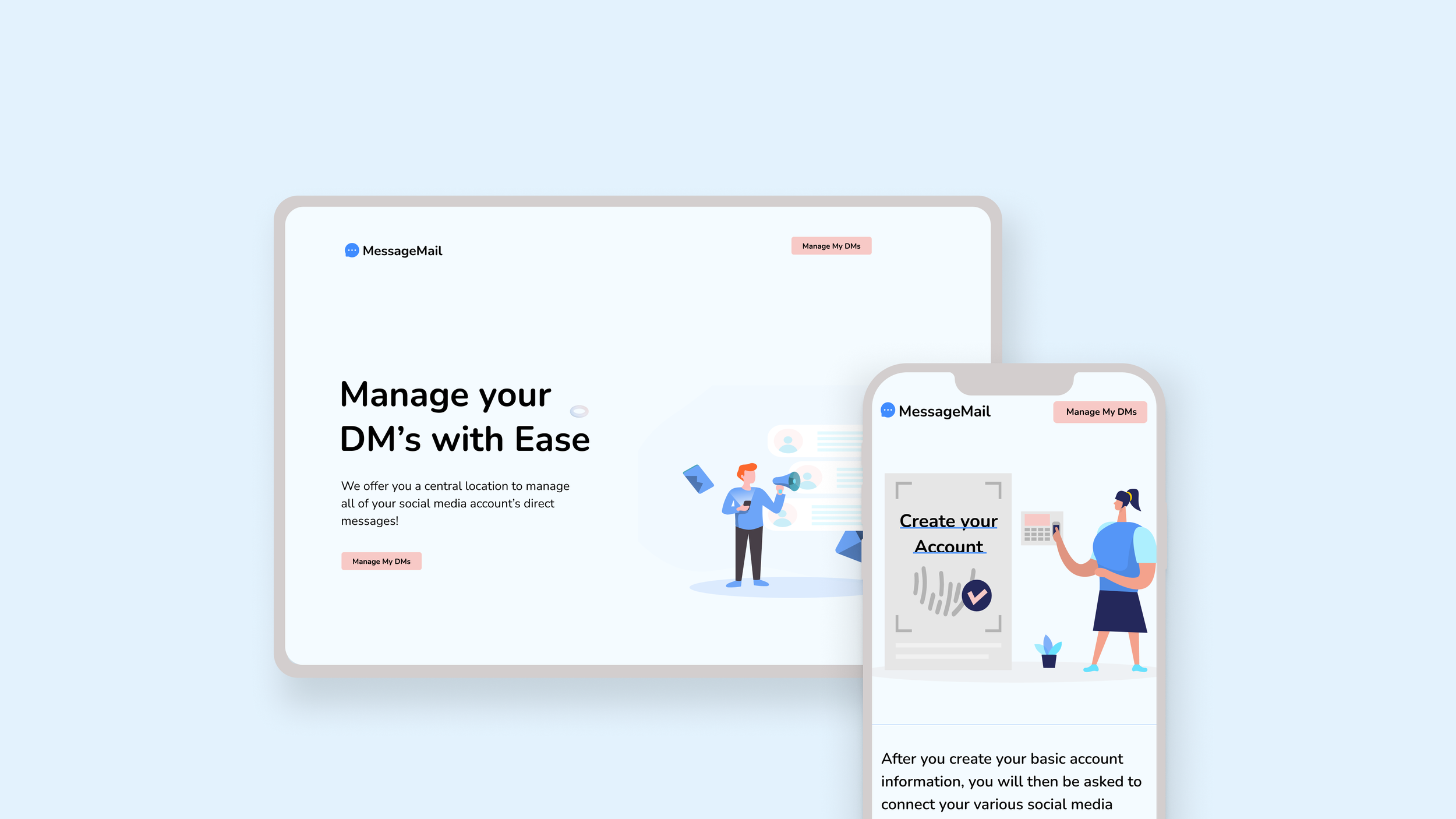
Thirdly, the high fidelity design. After the low-fidelity mockups have been designed and the right colors and fonts have been chosen, the final design comes into play.
MOBILE HIGH-FIDELITY
DESKTOP HIGH FIDELITY
The designing process, in short, is:
Research > empathise > ideate > design > test
RESULTS
After numerous user tests and thorough research, I came up with the best design for a landing page that is both easy to use and pleasing to the eye.
WHAT' I’D DO DIFFERENTLY NEXT TIME
Better Logo: MessageMail was one of my first UI projects and I am not quite satisfied with the logo. Going forward, I would design better, more pleasing logos that would attract specific users.
Add more effects: After analyzing my designs too many times, I realized adding effects such as neumorphism would have attracted more users.


